



Picture two analysts presenting the same sales figures to the same leadership team. The first opens a dense dashboard, walks through every filter and finishes with “so, that’s the data”. The second says, “We are losing margin in one product line, here is why, and here is what we should do about it.” Only one of them leaves with a decision. That gap is data storytelling, and it explains why Australian employers increasingly pay more for people who can explain data than for people who only build the reports.
Thank you for reading this post, don't forget to subscribe!This is not an argument against technical skill. A trustworthy report still needs a solid build. It is a point about where the extra value sits. In this guide we look at what data storytelling really means, why it commands a premium, and how you can develop it using Power BI. We also point you to courses for learners in Sydney, Melbourne, Brisbane, Perth, Adelaide and Canberra.
Quick answer: Australian businesses pay more for people who explain data because explanation turns numbers into understanding, and understanding is what gets decisions made. data storytelling combines a clear message, the right evidence and a recommended next step, so non-technical leaders can act with confidence.
Why Australian businesses pay more for data storytelling than for dashboard building
Think about who actually consumes a report. It is rarely another analyst. It is a general manager with six meetings today, a finance lead preparing a budget, or a board member who has four minutes to read a page. These people do not want to explore the data. They want to know what it means for them.
A dashboard offers information. A good story offers understanding. Information still leaves the reader to do the hard work of deciding what matters, while understanding hands them a conclusion they can test and act on. When a business has to choose between a person who produces more information and a person who produces clarity, clarity tends to win the pay conversation.
There is also a risk argument. Poorly explained numbers get misread, and a misread number can steer a pricing, hiring or investment choice in the wrong direction. Someone who communicates findings accurately, and flags what the data cannot tell you, protects the business from expensive mistakes.
Dashboard builder or data explainer: how the two differ
The same person can play both roles, but the habits are different. Here is how they show up in everyday work:
| Situation | Dashboard builder | Data explainer |
| Opening a meeting | Shares the screen and starts clicking | States the main finding in one sentence |
| Facing “so what?” | Offers more filters or another page | Gives a clear recommendation and its reasoning |
| Audience | Designs for themselves or other analysts | Designs for the busiest person in the room |
| A number looks odd | Waits to be asked about it | Raises it first and explains the cause |
| After the meeting | Moves on to the next request | Follows up on what was decided |
Notice that none of the right-hand habits needs new software. They need a different mindset, and that mindset can be trained.
What data storytelling actually involves
Despite the name, data storytelling is not about decoration or drama. It does not mean adding colour or inventing a plot. At its core it has three parts that work together:
- Context: why this matters, to whom, and compared with what.
- Insight: the one finding that changes how someone thinks about the problem.
- Action: what you recommend, what it might cost and what happens if nothing changes.
Leave out any one of these and the message weakens. Context without insight is background noise. Insight without action is trivia. Action without context is just an opinion.
A 4-step data storytelling framework you can use this week

- Know your audience. Ask who will read this, what they already know and what decision they face. A finance director and a frontline manager need very different versions of the same facts.
- Find the single message. Write one sentence that begins, “The main thing to know is…”. If you cannot finish it, you are not ready to present yet.
- Show only the evidence that supports it. Pick the simplest chart that proves the point, and remove anything that distracts from it. A clear title that states the finding beats a vague label every time.
- End with the next step. Say what you recommend and who needs to act. Leaders remember a clear request far more than a long list of observations.
Data storytelling inside Power BI
Power BI is not only a charting tool. Several of its features support explanation directly:
- Findings as titles. Replace “Revenue by month” with “Revenue fell for three months in a row”. The title does the explaining before anyone reads the chart.
- Guided navigation. Bookmarks let you walk an audience through a sequence of views, much like slides, while keeping the data live.
- Written summaries. The smart narrative visual generates a text summary of a page or visual, which you can then edit into your own words.
- Drill-through for follow-up questions. Let readers move from the headline to the detail only when they ask for it, so the first view stays clean.
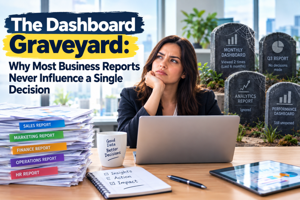
You will practise these skills across our Power BI Beginner Course and Power BI Intermediate Course, which cover building interactive dashboards and drill-through report pages with real scenarios. If you want to see how reports can fail to land, read our piece on the dashboard graveyard.
Five data storytelling mistakes that cost you credibility
- Showing everything. More charts do not make you look thorough. They make the message harder to find.
- Leading with the method. Executives care about the result first. Explain how you got there only if they ask.
- Hiding the uncertainty. Say what the data cannot tell you. It builds trust rather than weakening your case.
- Using jargon. Swap technical terms for the language your audience uses, such as “margin by product” instead of “calculated measure”.
- Finishing without a recommendation. If you stop at the finding, someone else will decide what it means.
Skills and courses that build data storytelling
Strong storytelling sits on top of solid technical foundations. A sensible learning path looks like this:
- Start with the basics. The Power BI Beginner Course teaches you to connect data, transform it with Power Query and build your first interactive dashboard.
- Add calculation and structure. The Power BI Intermediate Course covers DAX, drill-through pages and row-level security.
- Go deeper on performance. The Power BI Advanced Course focuses on complex DAX, time intelligence and optimised models.
- Validate your skills. The PL-300 Microsoft Power BI Data Analyst course prepares you for the Power BI Data Analyst Associate
- Widen your toolkit. Introduction to Microsoft Power Platform (PL-900) and the DP-600T00 Microsoft Fabric Analytics Engineer course suit people moving into broader analytics roles.
Communication and analysis rank high on the World Economic Forum’s Future of Jobs reporting, which keeps highlighting analytical thinking among the skills employers want. For more on how this affects pay and promotion, see our articles on why businesses pay more for people who influence decisions and why some professionals become indispensable at work.
Data storytelling training by city
Wherever you are in Australia, you can build these skills. Our training combines in-person rooms in major cities with live online delivery:
- Sydney: face-to-face training in the CBD area, plus live online. See Power BI courses in Sydney.
- Melbourne: in-person training in West Melbourne, plus live online. See Power BI courses in Melbourne.
- Brisbane: a dedicated training room in the city, plus live online. See Power BI courses in Brisbane.
- Perth: live online and onsite or in-house delivery. See Power BI courses in Perth.
- Adelaide: live online and onsite or in-house delivery. See Power BI courses in Adelaide.
- Canberra: live online and onsite or in-house delivery. See Power BI courses in Canberra.
Teams can also arrange tailored programs. Compare every option on our Power BI course locations page, or contact us about corporate training.
A 14-day plan to practise data storytelling
- Days 1 to 3: Pick one report you produce. Write its main message in a single sentence.
- Days 4 to 7: Rewrite each chart title as a finding, and remove any visual that does not support the message.
- Days 8 to 10: Add a clear recommendation and one sentence about what the data cannot tell you.
- Days 11 to 14: Present it in five minutes to a colleague outside your team. Ask what they would do next, then refine.
If you want portfolio-ready examples to show employers, our guide to Power BI portfolio projects is a useful next read, along with why most Power BI learners never become data analysts.
Frequently asked questions
What is data storytelling?
Data storytelling is the practice of combining data, clear visuals and a simple narrative so that non-technical people understand what the numbers mean and what to do about them. It is about clarity, not decoration.
Is data storytelling a technical skill or a soft skill?
Both. You need enough technical ability to build accurate reports, and enough communication skill to explain them. Employers value the combination because it is rare.
Do I need a Power BI course to learn data storytelling?
You can practise the ideas anywhere, but a structured course helps you apply them in a real tool with real datasets. Our courses use practical Australian business scenarios from day one.
Is Power BI good for data storytelling?
Yes. Features such as bookmarks, drill-through, tooltips and the smart narrative visual help you guide readers through a message while keeping the data interactive.
Are Power BI courses available online in Australia?
Yes. All our courses are available through live online delivery across Australia, with in-person options in Sydney, Melbourne and Brisbane.
Ready to explain your data with confidence?
Mastering data storytelling is one of the most direct ways to raise your value at work. Explore our Power BI courses, or enquire today and call 1300 649 299 to talk to a course advisor. Start by rewriting one chart title this week so that it states a finding, not a label.