



Power BI dashboard design is where most business reporting quietly fails. A team spends weeks building a report, the launch email goes out, a few people click around for a day, and then nothing. The dashboard sits in a workspace, refreshing every morning for an audience that stopped looking. Multiply that by every department in a company and you get what I call the dashboard graveyard: a collection of technically correct reports that never change a single decision.
Thank you for reading this post, don't forget to subscribe!This guide explains why it happens, what separates a dashboard that gets used from one that gets buried, and how better Power BI dashboard design turns reports into decisions. We will also look at the skills and courses behind it, how the issue shows up in Sydney, Melbourne, Brisbane, Perth, Adelaide and Canberra, and a practical 30-day plan to bring a dead dashboard back to life. If you want to build these skills properly, our Power BI courses run from beginner to advanced.
What Is the Dashboard Graveyard?
The dashboard graveyard is the pile of reports that were built, delivered and then ignored. It isn’t a technology problem. The visuals load, the numbers refresh, and the filters work. The problem is that nobody can point to a moment when the report changed what someone did.
A useful test is brutally simple: name the last decision that this dashboard influenced. If the answer is silence, the report is decoration. Decoration is expensive, because it costs build time, licence capacity, maintenance and, most of all, trust. Once people learn that reports are noise, they stop opening the good ones too.
Why Most Business Reports Never Influence a Decision
1. They Were Built Without a Decision in Mind
Most requests begin with “Can you build us a dashboard for sales?” rather than “What decision do we need to make faster?” Without a decision at the centre, Power BI dashboard design turns into a display of everything available. A report that answers no specific question can’t drive a specific action.
2. They Show Too Much
Twenty visuals, fifteen slicers and six colours feel thorough. To a busy manager, they feel like homework. When everything is highlighted, nothing is. People retreat to a familiar spreadsheet or ask a colleague for the number instead.
3. Nobody Trusts the Numbers
One mismatch between the dashboard and the finance report is enough to end its life. If definitions are unclear, refresh times are unknown, or two dashboards show different totals for the same measure, users quietly stop relying on any of them.
4. There Is No Owner and No Action Attached
A dashboard without an owner drifts. Nobody updates targets, fixes broken filters or retires outdated pages. And even a good report fails if there is no meeting, process or alert that says, “When this number moves, we do this.”
5. The Report Lives Outside the Workflow
If people have to remember to open a workspace, they won’t. Reports that influence decisions show up where decisions are made: in the Monday meeting, in a scheduled email, in Teams, or in an alert that arrives when a threshold is crossed.
Graveyard Dashboard vs Decision Dashboard
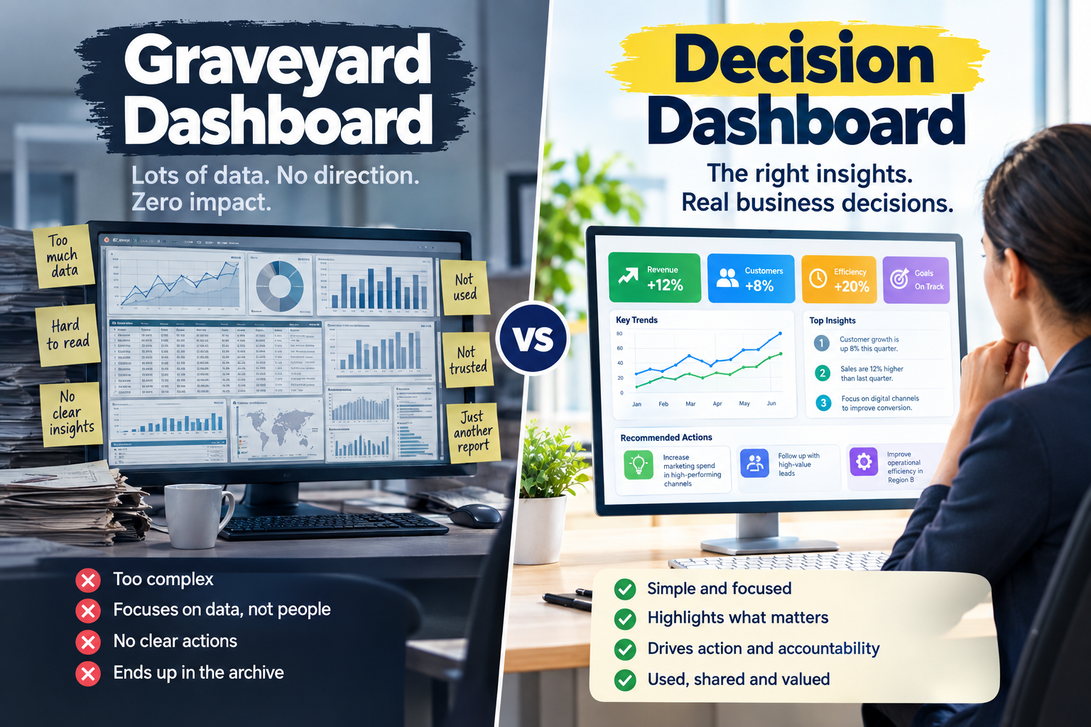
The difference in Power BI dashboard design is easy to see when the two approaches sit side by side.
| Area | Graveyard Dashboard | Decision Dashboard |
| Starting point | “Show us everything about sales” | “Which regions need action this week?” |
| Layout | Dozens of visuals on one page | One page, one question, clear hierarchy |
| Metrics | Raw totals with no context | KPIs with targets, trends and variance |
| Trust | Definitions unclear, refresh unknown | Documented measures and visible refresh time |
| Delivery | Buried in a workspace | Embedded in meetings, email and alerts |
| Ownership | Built once, then abandoned | Named owner with a review cycle |
Power BI Dashboard Design Principles That Change Decisions
Good Power BI dashboard design is less about clever visuals and more about disciplined choices. These principles come up again and again in reports that actually get used.
- Start with the decision. Write one sentence before you open Power BI Desktop: “This dashboard helps [who] decide [what] by [when].”
- One page, one question. If a page answers three questions, split it into three pages.
- Give every number context. A figure alone is trivia. Show it against target, last period or a benchmark so the reader instantly knows if it is good or bad.
- Build a visual hierarchy. Put the most important KPI top left, supporting trends beneath, and detail behind drill-through pages.
- Use colour to signal, not decorate. Reserve red and green for exceptions so they mean something when they appear.
- Design for the audience. Executives need a fast summary; analysts need filters and detail. Row-level security and separate report pages help you serve both.
- Make performance a feature. A dashboard that takes ten seconds to load loses people before the first chart appears.
- Show when the data was last refreshed. It is a small detail that builds a surprising amount of trust.
The Skills Behind Power BI Dashboard Design That Works
A dashboard that influences decisions sits on top of several skills, and most graveyard reports are missing at least one of them.
- Data modelling. A clean star schema makes measures accurate and fast. Our Power BI Intermediate course covers DAX, drill-through pages and row-level security.
- Power Query. Reliable, repeatable data preparation keeps numbers consistent. It is a core part of the Power BI Beginner course, and our guide on Power Query vs DAX explains what to learn first.
- DAX and performance tuning. For complex time intelligence and enterprise models, see the Power BI Advanced
- The ability to say “here is what this means and what we should do” is what turns a chart into a decision.
- The PL-300 Power BI Data Analyst course helps validate your skills, and Microsoft’s Power BI documentation is a useful reference as features change.
If you are moving toward Fabric or want the wider platform picture, the DP-600 Fabric Analytics Engineer and PL-900 Power Platform courses are natural next steps. For a broader analytics pathway, see our sister site’s data analytics courses.
A Seven-Question Dashboard Audit
Before you invest in more Power BI dashboard design, run your existing reports through this quick audit. Any “no” answer is a clue to why a dashboard ended up in the graveyard.
- Can you name the decision this dashboard supports?
- Can you name the person who makes that decision?
- Does every page answer one clear question?
- Does every number have a target, trend or comparison?
- Does everyone agree on how the key measures are defined?
- Is the report delivered where decisions happen, such as a meeting, email or Teams channel?
- Does someone own it and review it on a schedule?
Power BI Dashboard Design Across Australian Cities
Power BI dashboard design problems look similar in every city, but the flavour changes with local industries.
Sydney. Finance, insurance and consulting teams often drown in KPI-heavy reports, so clear hierarchy and variance analysis matter most. See Power BI courses in Sydney.
Melbourne. Healthcare, retail and government reporting benefits from simple, trusted views that busy managers can scan in seconds. Explore Power BI courses in Melbourne.
Brisbane. Construction, logistics and resources businesses need dashboards that track cost, schedule and safety without clutter. Check out Power BI courses in Brisbane.
Perth. Mining and energy operations depend on fast, accurate operational reporting, where a slow or confusing dashboard costs real money. Find Power BI courses in Perth.
Adelaide. Defence, health and advanced manufacturing teams need governed reports that people can trust. See Power BI courses in Adelaide.
Canberra. Government agencies need auditable, well-documented reporting that stands up to scrutiny. Take a look at Power BI courses in Canberra.
For a broader view of where Australian employers are hiring, Jobs and Skills Australia publishes labour market research that is worth bookmarking.
Can Copilot Fix the Dashboard Graveyard?
AI features can speed up report building and summarise what a page is showing, which is genuinely useful. But faster building can also mean faster graveyard filling. Copilot won’t decide which decision a report should support, or whether the underlying data is trusted. Good Power BI dashboard design still starts with human judgement. If you want to see where AI helps, read our post on Microsoft Copilot in Power BI.
A 30-Day Plan to Bring a Dead Dashboard Back to Life
Fixing Power BI dashboard design after launch is entirely possible. Here is a simple month-long routine.
- Week 1: Interview the audience. Ask three users what decision they make each week and what they use today instead of the dashboard.
- Week 2: Cut ruthlessly. Remove any visual that doesn’t serve the decision. Add targets and trend lines to the KPIs that remain.
- Week 3: Fix trust. Document the key measures, show the refresh time and reconcile the totals against the finance source.
- Week 4: Move it into the workflow. Schedule a subscription email, add it to the weekly meeting agenda, and set an alert on the one metric that matters most.
Then track one simple outcome: how many decisions referenced the dashboard this month? That number is the real measure of success. Our posts on Power BI skills employers want and Power BI portfolio projects show how to turn this kind of result into career proof.
Common Mistakes in Power BI Dashboard Design
- Starting with the data instead of the decision.
- Adding visuals because there is space, not because there is a question.
- Skipping the conversation with the people who will actually use the report.
- Ignoring performance until users complain.
- Launching without a plan for ownership and updates.
Frequently Asked Questions About Power BI Dashboard Design
Why do most business dashboards go unused?
Usually because they were built without a specific decision in mind, show too much information, lack trusted definitions, or sit outside the meetings and workflows where decisions happen.
What makes a good Power BI dashboard?
A good dashboard supports one clear decision, shows numbers with targets and context, loads quickly, uses colour sparingly, and comes with an owner who keeps it current.
How many visuals should a Power BI page have?
There is no magic number, but fewer is almost always better. Aim for a handful of visuals that answer one question, and move supporting detail to drill-through pages.
Can beginners learn Power BI dashboard design online?
Yes. Live online classes let you learn from anywhere in Australia around your work hours. Browse the course list or the FAQ page for delivery options.
Do I need PL-300 to build good dashboards?
Not strictly, but the certification path covers modelling, DAX and report design in a structured way, which many learners find helpful.
Final Thoughts: Build Dashboards People Actually Use
Most reports fail not because Power BI is limited but because the thinking behind them was. When you anchor Power BI dashboard design to a real decision, trim the noise, earn trust in the numbers and put the report where people work, dashboards stop being decoration and start driving action.
Ready to build reports that get used? Explore our Power BI courses, or speak to a course advisor on 1300 649 299 to find the right level for you.